
A history of Baylor’s interlocking BU
They’re united in the minds of Baylor fans — the green and the gold, the B and the U — and have been, in many ways, for nearly a century.
Saturday’s unveiling of the new logo and unified school colors at the long-awaited Baylor United experience before the spring football game introduced the Baylor Family to a new, yet familiar look for Baylor Athletics. New, because of tweaks to the traditional BU, the addition of a new bear logo, and the standardization of colors across all of Baylor’s 17 varsity sports. Familiar, because at its heart, its still the interlocking BU and the green and gold colors that we’ve loved for generations.
While the story of how the university got its green and gold is well known, Baylor fans might be surprised to learn just how far back the interlocking BU goes — more than a century, in a variety of iterations.
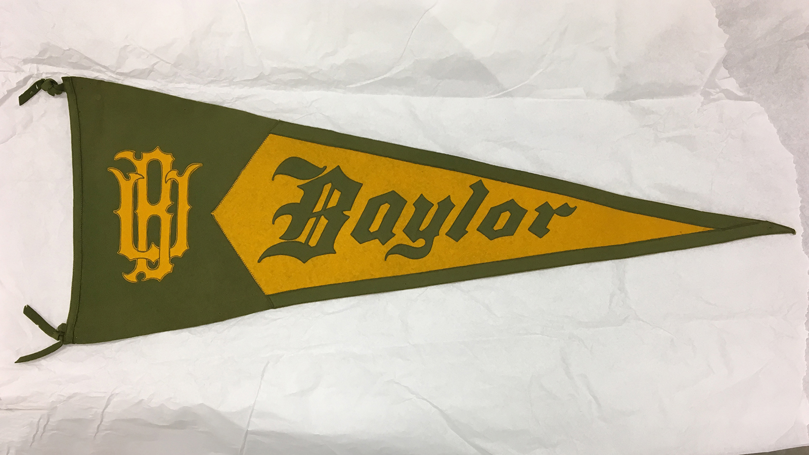
In their earliest days, Baylor athletic teams were “wearers of the B.” A version of this lives on today in letterman’s jackets and the Baylor “B” Association.
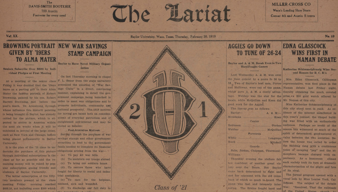
It’s unclear whether the image below is an interlocking BU, or perhaps a “BV” — maybe for “Baylor Varsity”? But it appeared on the front page of a 1919 edition of The Baylor Lariat, and might be our earliest known example of the BU:
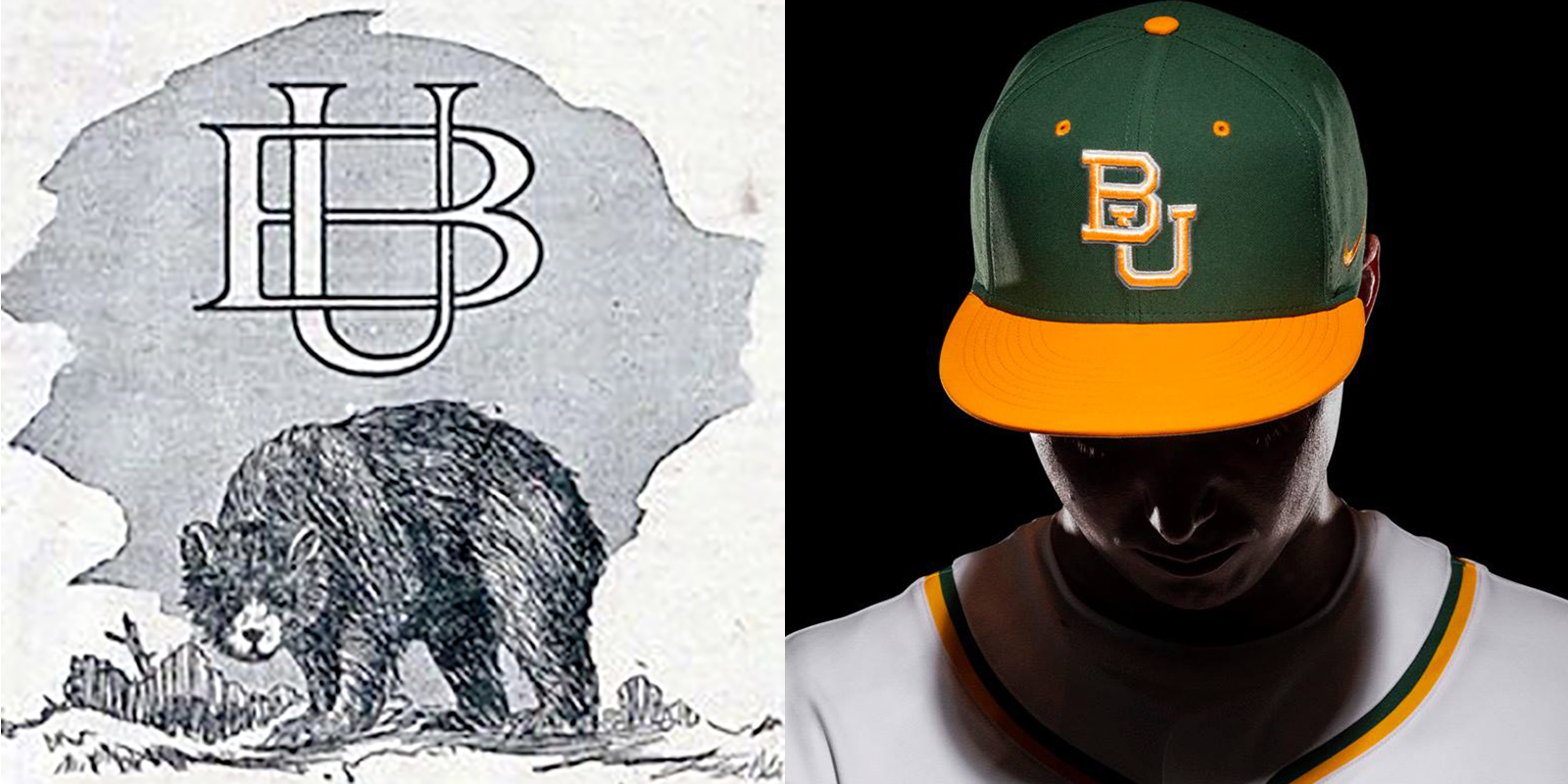
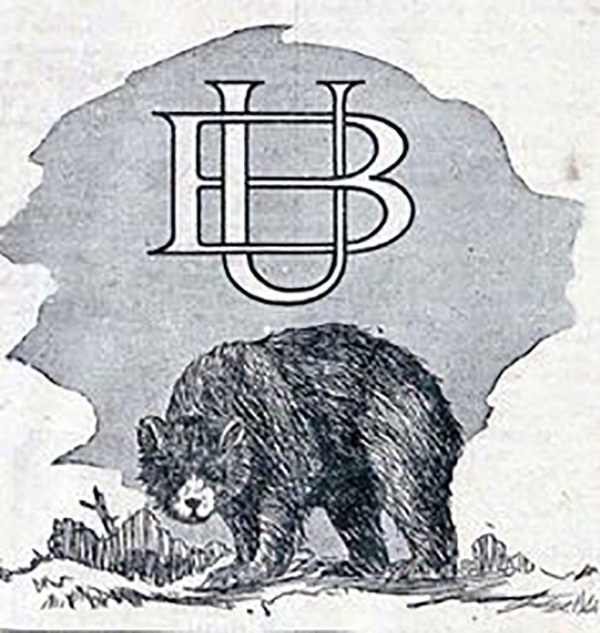
This one is much clearer, and is our earliest known definitive example of the interlocking BU. The ornate, almost gothic BU is completely united in the sense that the U surrounds the B, as opposed to the lower right U we know today.
The Bear mascot was officially adopted in 1914; it’s possible this image appeared not so long after that seminal moment. It was never an official mark, but then again, that wasn’t so much of a thing back then.
In the 1950s, the evolution of our current BU came more clearly into focus. The interlocking BU first began officially appearing on athletic uniforms in the late 1950s. Although it lacks serifs and notches, the BU in this hat is clearly recognizable as a retro version of what we see today.

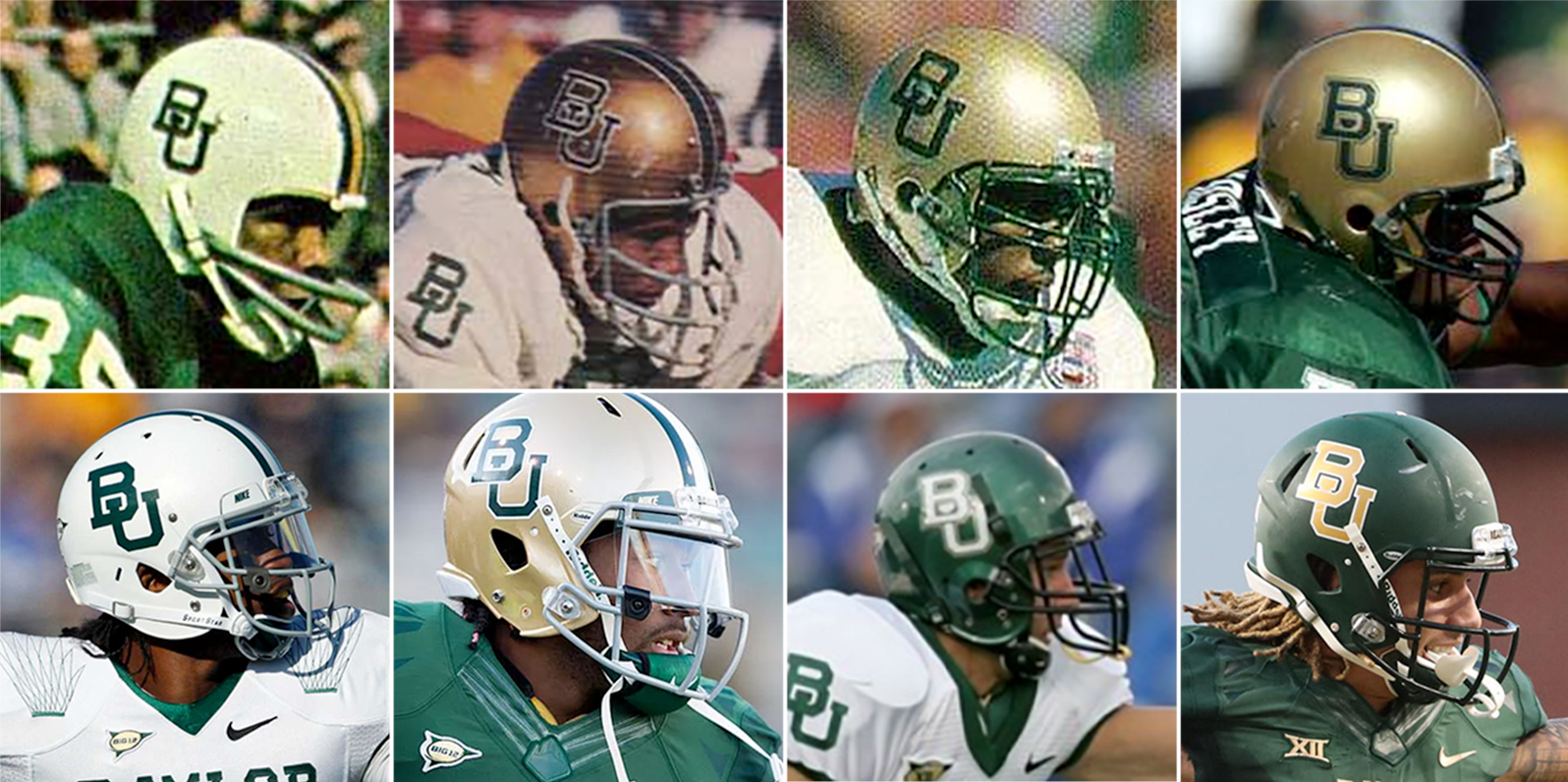
Interestingly, the BU didn’t make it onto the Bears’ football helmets for another decade or so — and the format of the BU (height, width, outline, etc.) continued to vary over the next few decades (as seen on the helmets below).
In recent years, the BU has popped up in more and more non-athletic uses, as well. Current students have been welcomed by the BU (on admissions materials), worn the BU proudly in science and nursing labs (on lab coats and scrubs), and been sent out into the world wearing the BU (on the sleeves of Commencement robes).

Now, we turn the page to a new era. Built in partnership with Nike, this interlocking BU remains a keystone symbol of all things Baylor — across all parts of the university — and anchors a United rebranding that brings together the entire university in a unified look that is distinctly Baylor.
Sic ’em, Bears!
You might also like:
* A quick look at Baylor’s bear logos through the years (April 2019)
* Why are green and gold Baylor’s official school colors? (March 2017)